| San Francisco Modern Architecture |
| A guide to interesting homes and commercial buildings. |
| Residences |
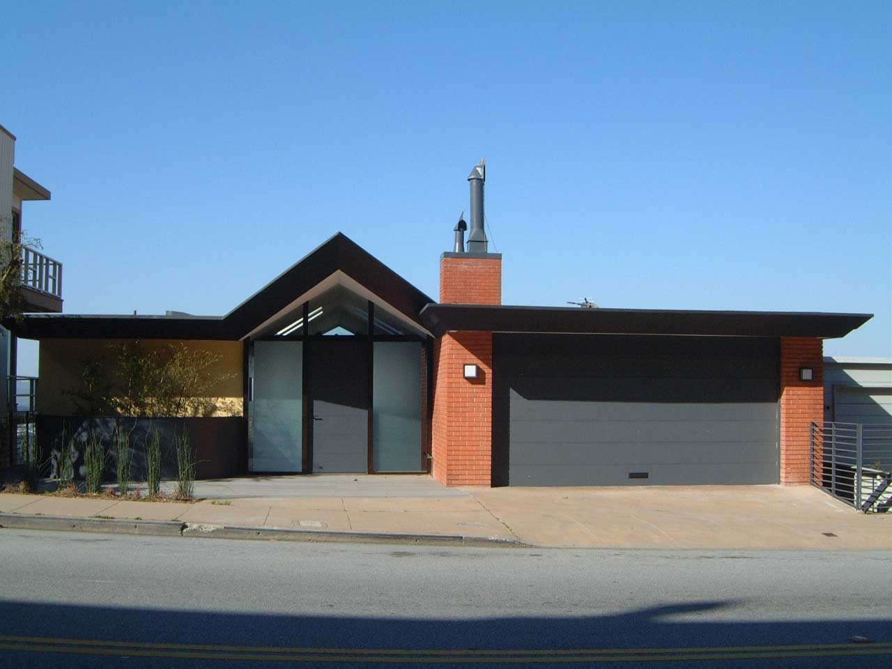
This house shares the street with the pink house and the white one with the small square windows. It has amazing views of the City and East Bay. It is a mixture of 1950s (the peaked roof is very Eichlerish) and 1980s (the use of contrasting, multiple materials and colors). I like its low profile and how it seems to be hugging the ground - I would if I were perched on this steep hillside! The house maybe has a lower level because the double car garage takes up almost half the house's width and from looking through the windows above the door, the depth of the house is rather shallow. The frosted glass panels on either side of the front door are teasers - we want to look inside - but are only allowed a glimpse of the ceiling. The left hand side glass panel - on the far left side - has some clear glass that allows you to peek through. This house is a mixture of public and private and with its yellow paint, red brick and teasing glimpse inside - it is a very coy structure - you just want to be invited inside!
After I originally wrote this I received an email from an architect. This
is what he had to say:
The house was "originally designed by Aaron Greene - a Frank Lloyd Wright apprentice and associate who executed the Marin County Civic Center. It was built in 1958. We (Herbert Lewis Kruse Blunck Architecture) renovated the house last year removing four decades of poor remodeling decisions. Our renovation was sensitive to the original planning strategies but is a total change. The house does have a lower level which houses three bedrooms and a sitting area. The upper level is comprised of a single, large living and dining area, a kitchen, gallery, and garage.
It is amazing to see how quickly you discovered this house since it has
been complete for less than a year."
